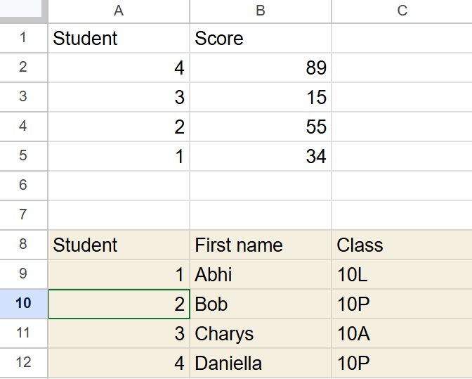
Joining two tables together is a very common task for data analysis. Imagine you have these two tables
Let’s say that the first table came from a Google Quiz you did, while the second came from your existing data. You’d like a quick way of adding each students score next to their name.
VLOOKUP will do this quickly and easily. All you need to do is paste the two tables into different tabs of a spreadsheet. Then, use the command below:
VLOOKUP(search_key, range, index, [is_sorted])Here, the ‘search_key’ is the value you want to find. Let’s add a column to our students table that’s going to hold our data:
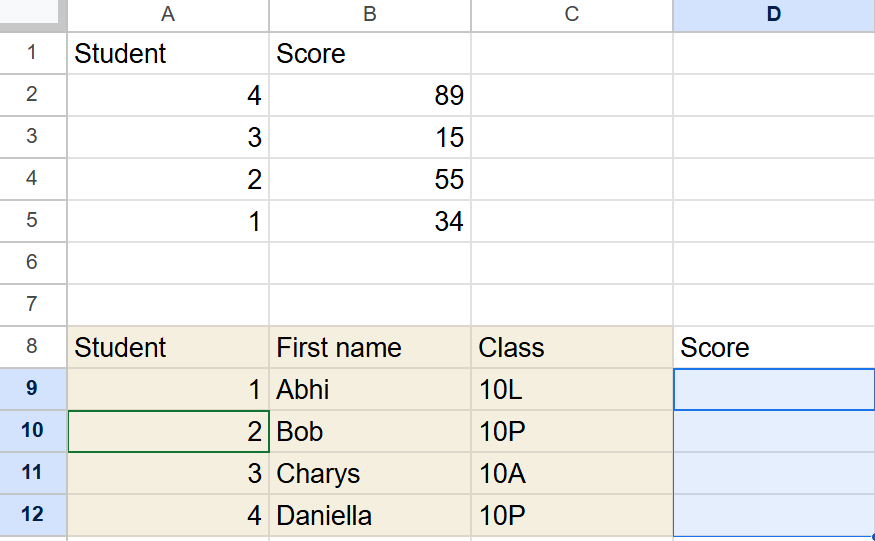
We now need to add a formula to search for the data in the table range A1:B5.
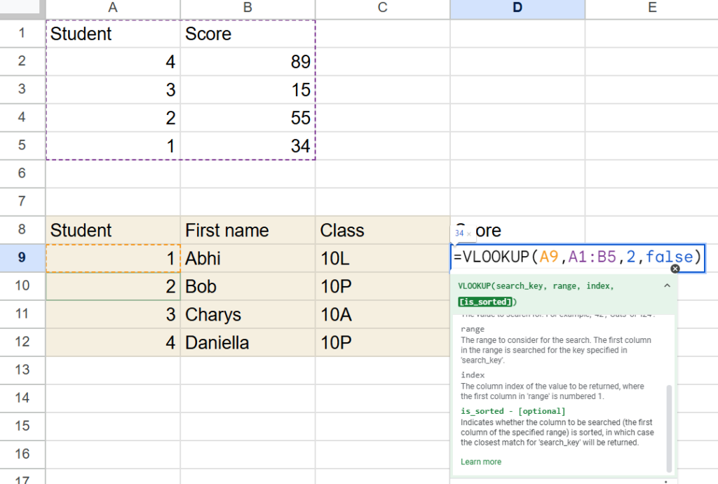
In the formula, we need a search _key. This is the thing that we’re gong to look for in the other table. For the first row (row 9), that’s 1. For the second row, it’s 2. Instead of manually typing it, we’ll chose the value of cell A9 so that Google Sheets will read in the value for us, rather than typing it:
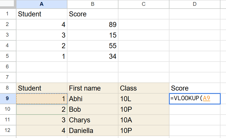
Note that Google Sheets has helpfully but a coloured boarded around cell A9, showing us that we’re going to take the value from this cell as the search_key.
Next, we need range. The range tell Google sheets where to look for the same number. You can have as many columns as you like in a range, but the first column must be the same as the search key.
Our scores come from the range A1:B5, so we’ll add that as our range. Note that the matching values for student are in the first column of our selected range. We don’t know which row will match our search_key, so we’ll select the entire table and let Google Sheets figure out which row to use.
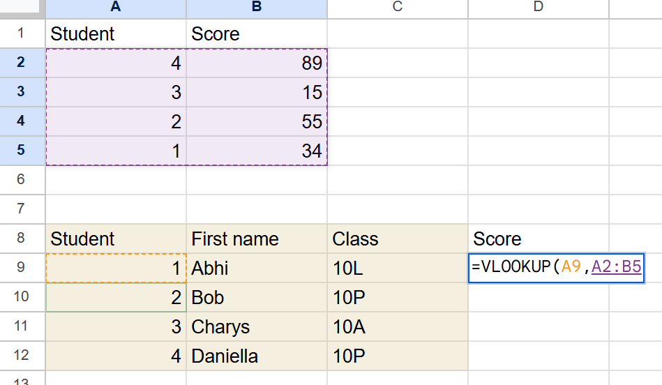
Again, note that Google has coloured the cells for us, and even used a different colour to show us that it’s being used in a different place.
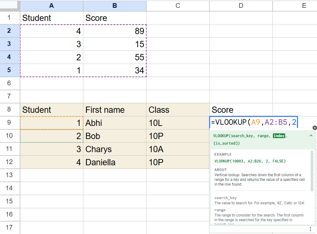
Now, we want to tell Google Sheets what value we want to actaully displayin our cell. This is the index part of the formula. If you want the first column to be displayed, enter a 1. That would be a bit silly, as it would just be showing the student number again. As we want the score, let’s ask for the second column:
Hit enter, and you’ll find that it doesn’t seem to be working!
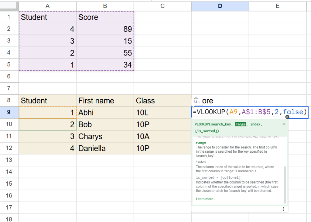
An #N/A means that Google Sheets couldn’t find your data. Why not? This is because, by default, Google Sheets thinks that your data will be sorted from smallest to biggest. This is really useful for calculating grades from raw scores, but not useful here. In order to tell Sheets that this isn’t in any sort or order, add the word ‘false’ to the formula:
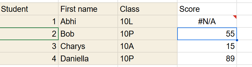
Almost there! If you hit return, you’ll find that the correct value appears. But something strange happens if you drag the formula down to each row:
Most values have appeared correctly, but the third row is saying #N/A. If you hover over this, you’ll see the error: Did not find value ‘3’ in VLOOKUP evaluation. This is frustrating, because we can see that it clearly is in the table! What went wrong? Double click the cell to see the problem:
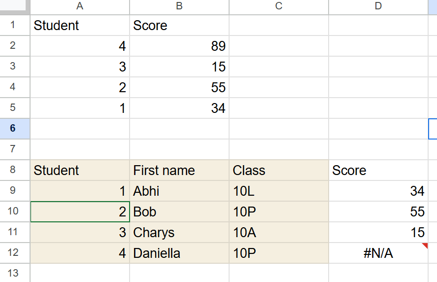
Here, we can see that the range that Google Sheets is searching for our value in has moved down. Sheets is trying to help us, by recognising that as we go down the spreadsheet, we usually want everything we’re referring to to move down as well. However, this isn’t what we want. Instead, we want the search key – the row with the value I’m searching for – to move down, but we want the range to remain the same. To fix this, add $ signs before any cell reference you want to keep the same:
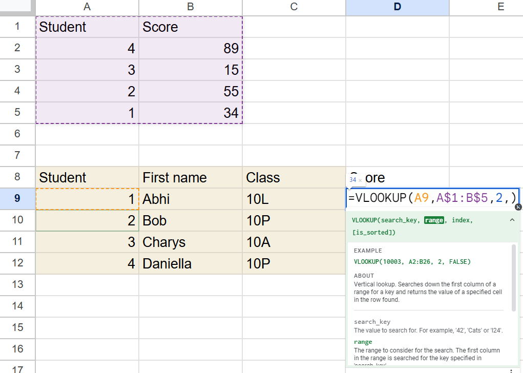
This will now prevent Google Sheets from increasing the first and last row numbers each time you fill the formula down. Now, our results look like this:
Ready to practise?
Try the exercises in the Google Sheet below to test your new skills.
https://docs.google.com/spreadsheets/d/1_f50Z5ZGgyfWTnfr078VkiFdvg4huRAaoNB0_SGCPXM/edit?gid=0#gid=0