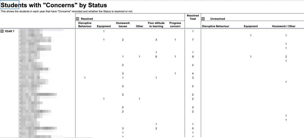
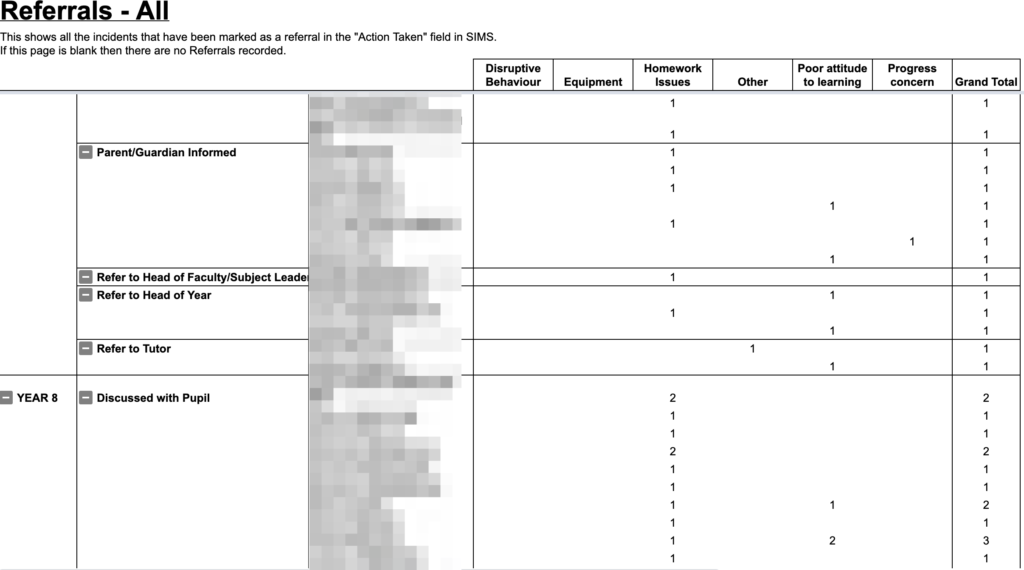
This is the second post in my series about how we created our Data Dashboard to bring together all the information we have on our students. In the first post I discussed how we visualised simple report data to get an overview of how teachers were reporting attitude and organisation to parents. Today, I’ll be talking about how we report behaviour, taking us from this:
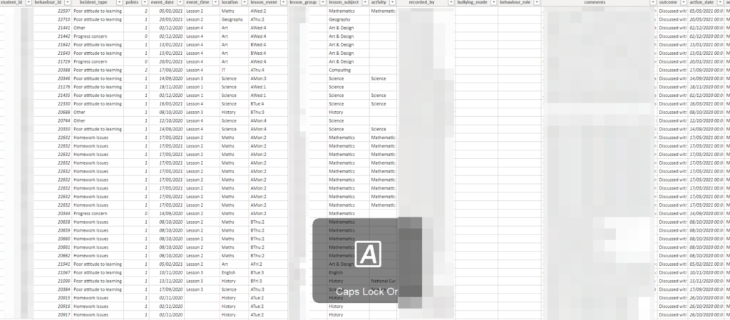
to this:

About behaviour
Capita’s SIMS.net allows for some pretty powerful behaviour reporting. At our school, we use both SIMS.net and EduLink One to enter data about students.
We are fortunate that the general standard of behaviour at our school is extremely high. As a result, we rarely have instances of low-level disruption or misbehaviour in our lessons. As a result of this, we don’t make much use of the behaviour management systems in SIMS for managing misbehaviour, since such instances are so rare they are able to be dealt with immediately. Instead, our behaviour reporting system is mostly concerned with the Social and Emotional aspects of learning, and with academic interventions.
Behaviour in SIMS.net
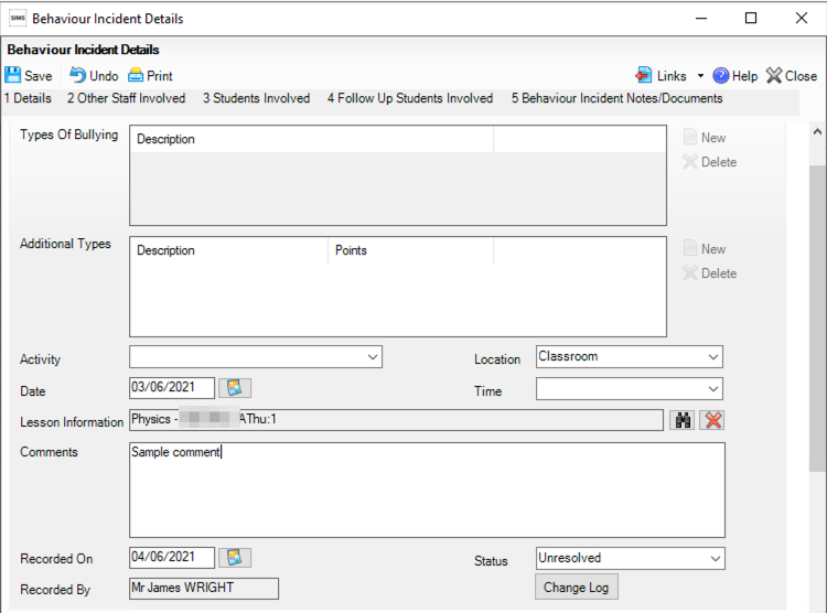
Behaviour incidents can be created in SIMS or EduLink quite easily:
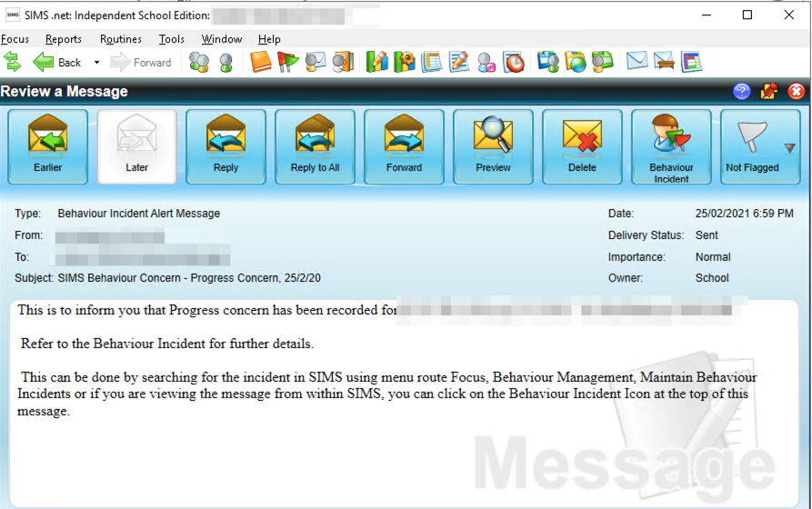
Our existing analytics
Our existing reporting tool was to use SIMS Reports to produce a weekly analysis of all behaviour incidents for the year-to-date, looking something like this:
These analytics were used by Heads of Year and Heads of Subject to look for trends in their respective areas. These reports were much quicker than looking through every email and student profile on SIMS, but still took quite a lot of manual checking and cross-referencing. Finding the comments for each report was also difficult, as one would have to cross-reference the subject and date of each incident to find out what actually happened.
Using PowerBI
We extracted our behavour logs directly into PowerBI, giving us this table:

Now, the key things that middle leaders wanted to know each week were:
- Which year groups, form groups and students had the most behaviour incidents?
- Which subjects had the most behaviour incidents?
- Are behaviour incidents increasing or decreasing?
For showing proportions, heatmaps are often the most intuitive form of display. To allow our middle leaders to see how each group was performing, we created a hierarchy that went Year –> Tutor group –> Student. This would let users click on a year group to expand it down to see the tutor groups with it.
We also wanted to be able to see the incidents immediately, so added a table with all the comments for each report. We also included slicers to allow us to filter by whether incidents were resolved or unresolved, or referred to different middle leaders;

We now have a much more intuitive, user-driven report. Clicking on any part of the heatmap will filter the table of incidents. This puts much more emphasis on the comments written by staff, and in turn helps staff to see the point of giving more detail in their incident reports. It also allows for easy follow-up, since the name of the reporting staff is always visible.
This view also bridges the gap between heads of year and heads of faculty. Before, they were using different reports in different exported spreadsheets. Now, they’re all literally on the same page, so can reference issues between themselves much more simply.
