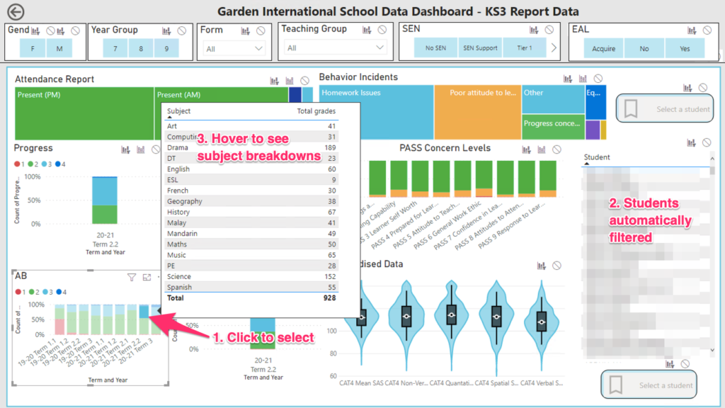
This post is the first in a series of entries I plan to make showing how we designed a bespoke data dashboard for our school. I’ll post links here to show how each aspect of our dashboard was created, leaving us with something that looks like this:
The Problem
At our school, we have a fairly simple way of reporting attitudinal and organisational behaviour to parents:
| Number | Attitudinal behaviour | Organisational behaviour |
| 1 | Below expectations | Below expectations |
| 2 | Meeting expectations | Meeting expectations |
| 3 | Exceeding expectations | Exceeding expectations |
| 4 | Exceptional | Exceptional |
Now, I know that from a data analysis point of view, this will initially look horrifying. Clearly a 1-4 scale is not suitable for any kind of analysis. However, I actually have come to quite like this system, as it is extremely simple for parents to understand. At a data analysis level, we have plenty of other indicators to tell us when a child is slipping in terms of their organisation of attitude, mainly through our Behaviour Management system. So really, if we see a ‘1’ in a report, we can use that as a warning sign that further investigation and intervention is needed.
These scores are reported on a termly basis. By the end of the year, a students simplified report card might look something like this:
| Subject | Term | Attitudinal Behaviour | Organisational Behaviour |
| Maths | 1.1 | Meeting expectations | Exceeding Expectations |
| Maths | 1.2 | Meeting expectations | Below expectations |
| Maths | 2.1 | Below expectations | Below expectations |
| Maths | 2.2 | Below expectations | Exceeding expectations |
| Maths | 3 | Meeting expectations | Meeting expectations |
| English | 1.1 | Meeting expectations | Below expectations |
| English | 1.2 | Below expectations | Below expectations |
| English | 2.1 | Meeting expectations | Meeting expectations |
| English | 2.2 | Meeting expectations | Meeting expectations |
| English | 3 | Exceeding expectations | Exceeding expectations |
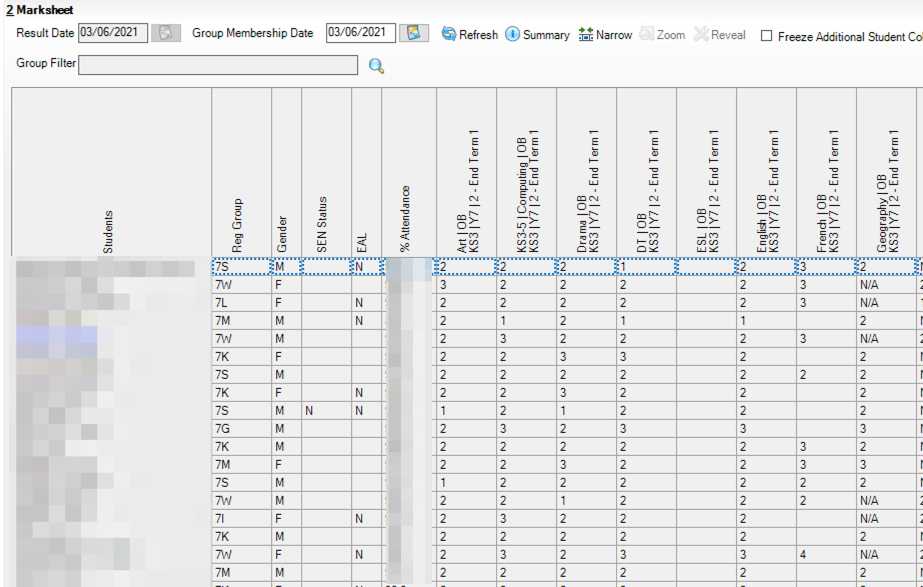
This is system is okay when looking at a single student, but becomes quite challenging for tutors and middle leaders when trying to analyse cohort data. Typically, our SIMS manager will create a marksheet that has all the data from each subject, like this:

Now this is okay, but it lacks finesse. Firstly, we will need to open seperate marksheets for each half-terms report data. We also need to manually look around for each score. While we could prettify it a bit with conditional formatting, this really isn’t optimal.
The PowerBI solution
The key requirements for a good visualisation of this data were:
- Show at a glance whether something was a 1, 2, 3 or 4
- Be able to show change over time
- Summarise the different data for each subject.
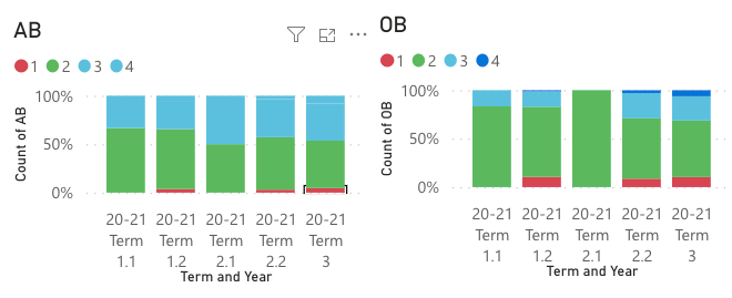
In the end, I went for a 100% stacked bar graph:

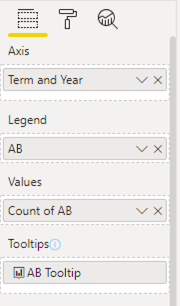
To create these, I added the following to the 100% stacked bar graph shelves:

You might notice the tooltip is going to a report page. This tooltip is a simple table showing the subjects and count of ABs, so that we get dynamic tooltips that show us which subjects gave each grade. We can also click a bar to get a list of which students were assigned that grade:

With this, we now have a much richer, filterable view of our data. A teacher can now filter our key indicators instantly, to see how aspects are changing by term, and link these back to students.
As I said at the start of this post, a 1-4 rating system is really only useful as a traffic light. Staff can use these to flag students for investigation, before using the other analytics tools the dashboard provides to start to explain why those scores were given.
In the next post, I’ll look at our behaviour reporting, and how we used hierarchies and tree-maps to gain a more initiative understanding of behaviour incidents in our school.
