Categories
Data Dashboard

Visualising SIMS data: Treemaps, Hierarchies and Behaviour Data

This is the second post in my series about how we created our Data Dashboard to bring together all the information we have on our students. In the first post I discussed how we visualised simple report data to get an overview of how teachers were reporting attitude and organisation to parents. Today, I’ll be talking about how we report behaviour, taking us from this:

to this:

About behaviour

Capita’s SIMS.net allows for some pretty powerful behaviour reporting. At our school, we use both SIMS.net and EduLink One to enter data about students.

We are fortunate that the general standard of behaviour at our school is extremely high. As a result, we rarely have instances of low-level disruption or misbehaviour in our lessons. As a result of this, we don’t make much use of the behaviour management systems in SIMS for managing misbehaviour, since such instances are so rare they are able to be dealt with immediately. Instead, our behaviour reporting system is mostly concerned with the Social and Emotional aspects of learning, and with academic interventions.

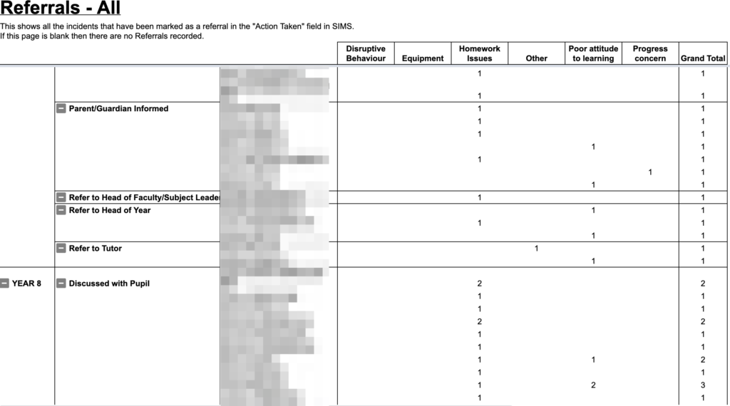
Behaviour in SIMS.net

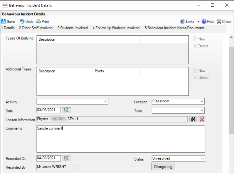
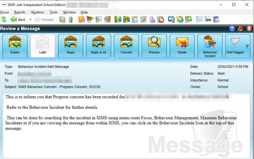
Behaviour incidents can be created in SIMS or EduLink quite easily:

Once created, an email and SIMS desktop alert are sent to linked teachers, including the form tutor and Head of Year:
This is decent for monitoring, but doesn’t allow for us to do any deeper analytics of trends in incidents.

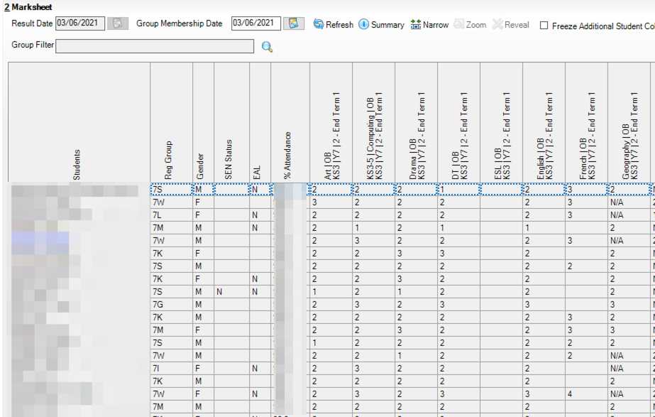
Our existing analytics

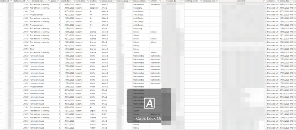
Our existing reporting tool was to use SIMS Reports to produce a weekly analysis of all behaviour incidents for the year-to-date, looking something like this:

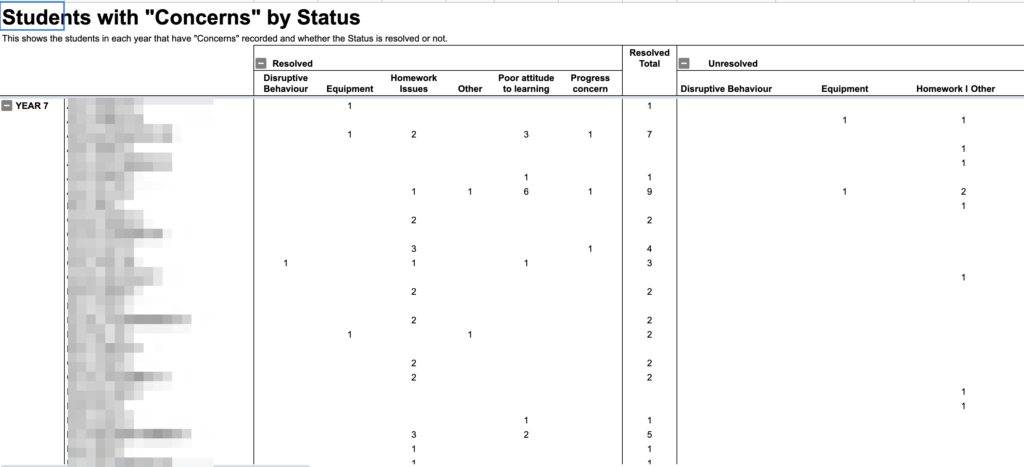
These analytics were used by Heads of Year and Heads of Subject to look for trends in their respective areas. These reports were much quicker than looking through every email and student profile on SIMS, but still took quite a lot of manual checking and cross-referencing. Finding the comments for each report was also difficult, as one would have to cross-reference the subject and date of each incident to find out what actually happened.
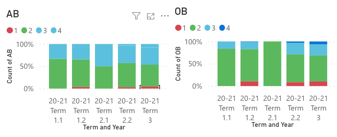
Using PowerBI

We extracted our behavour logs directly into PowerBI, giving us this table:

Now, the key things that middle leaders wanted to know each week were:

  • Which year groups, form groups and students had the most behaviour incidents?
  • Which subjects had the most behaviour incidents?
  • Are behaviour incidents increasing or decreasing?

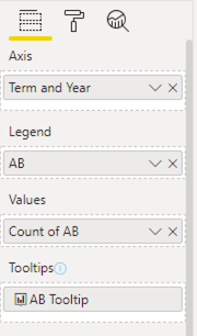
For showing proportions, heatmaps are often the most intuitive form of display. To allow our middle leaders to see how each group was performing, we created a hierarchy that went Year –> Tutor group –> Student. This would let users click on a year group to expand it down to see the tutor groups with it.

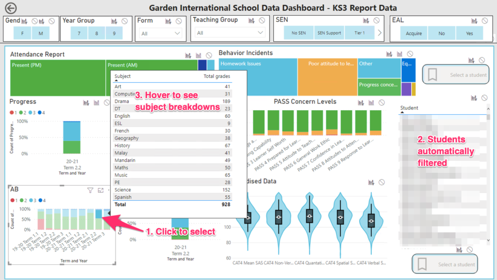
We also wanted to be able to see the incidents immediately, so added a table with all the comments for each report. We also included slicers to allow us to filter by whether incidents were resolved or unresolved, or referred to different middle leaders;

We now have a much more intuitive, user-driven report. Clicking on any part of the heatmap will filter the table of incidents. This puts much more emphasis on the comments written by staff, and in turn helps staff to see the point of giving more detail in their incident reports. It also allows for easy follow-up, since the name of the reporting staff is always visible.

This view also bridges the gap between heads of year and heads of faculty. Before, they were using different reports in different exported spreadsheets. Now, they’re all literally on the same page, so can reference issues between themselves much more simply.

Categories
Uncategorized

Visualising SIMS data: How are reports changing over time?

This post is the first in a series of entries I plan to make showing how we designed a bespoke data dashboard for our school. I’ll post links here to show how each aspect of our dashboard was created, leaving us with something that looks like this:

The Problem

At our school, we have a fairly simple way of reporting attitudinal and organisational behaviour to parents:

NumberAttitudinal behaviourOrganisational behaviour
1Below expectationsBelow expectations
2Meeting expectationsMeeting expectations
3Exceeding expectationsExceeding expectations
4ExceptionalExceptional
AB and OB descriptors

Now, I know that from a data analysis point of view, this will initially look horrifying. Clearly a 1-4 scale is not suitable for any kind of analysis. However, I actually have come to quite like this system, as it is extremely simple for parents to understand. At a data analysis level, we have plenty of other indicators to tell us when a child is slipping in terms of their organisation of attitude, mainly through our Behaviour Management system. So really, if we see a ‘1’ in a report, we can use that as a warning sign that further investigation and intervention is needed.

These scores are reported on a termly basis. By the end of the year, a students simplified report card might look something like this:

SubjectTermAttitudinal BehaviourOrganisational Behaviour
Maths1.1Meeting expectationsExceeding Expectations
Maths1.2Meeting expectationsBelow expectations
Maths2.1Below expectationsBelow expectations
Maths2.2Below expectationsExceeding expectations
Maths3Meeting expectationsMeeting expectations
English1.1Meeting expectationsBelow expectations
English1.2Below expectationsBelow expectations
English2.1Meeting expectationsMeeting expectations
English2.2Meeting expectationsMeeting expectations
English3Exceeding expectationsExceeding expectations
End of year report for a student

This is system is okay when looking at a single student, but becomes quite challenging for tutors and middle leaders when trying to analyse cohort data. Typically, our SIMS manager will create a marksheet that has all the data from each subject, like this:

Now this is okay, but it lacks finesse. Firstly, we will need to open seperate marksheets for each half-terms report data. We also need to manually look around for each score. While we could prettify it a bit with conditional formatting, this really isn’t optimal.

The PowerBI solution

The key requirements for a good visualisation of this data were:

  • Show at a glance whether something was a 1, 2, 3 or 4
  • Be able to show change over time
  • Summarise the different data for each subject.

In the end, I went for a 100% stacked bar graph:

To create these, I added the following to the 100% stacked bar graph shelves:

You might notice the tooltip is going to a report page. This tooltip is a simple table showing the subjects and count of ABs, so that we get dynamic tooltips that show us which subjects gave each grade. We can also click a bar to get a list of which students were assigned that grade:

With this, we now have a much richer, filterable view of our data. A teacher can now filter our key indicators instantly, to see how aspects are changing by term, and link these back to students.

As I said at the start of this post, a 1-4 rating system is really only useful as a traffic light. Staff can use these to flag students for investigation, before using the other analytics tools the dashboard provides to start to explain why those scores were given.

In the next post, I’ll look at our behaviour reporting, and how we used hierarchies and tree-maps to gain a more initiative understanding of behaviour incidents in our school.